Now there’s more mobile phones on Earth than people
Many of the active SIMs will be in ‘smart’ devices

digital development, design and training
Now there’s more mobile phones on Earth than people
Many of the active SIMs will be in ‘smart’ devices

Ok, not actually killing the service, at least not to the average user
– but they are killing the API
– a sad reminder to anyone who builds systems based on Google’s so-called ‘open’ APIs
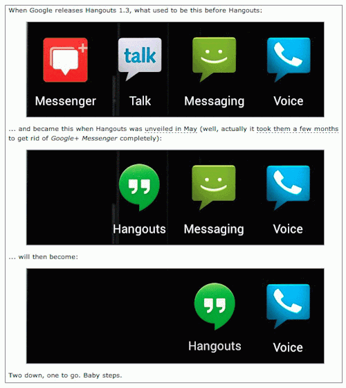
from http://9to5google.com/2014/03/18/google-plans-kill-google-voice-in-months-integrate-features-into-hangouts/

we come for travel information, not to have, on landing 1/3 of the screen filled with an advert (Google Play in this case) .. just because this split screen design is fashionable amongst young designers doesnt mean its ideal for everything (it has it place – if you have little to say perhaps and want a glossy image for your visitors feelgood) .. it actually looks like you’ve bought a cheap wordpress template ..
PS on resizing this text box the ‘submit’ button falls below the fold and is no longer available (Chrome)
I appreciate my comment about ‘young designers’ may offend: an image is worth a thousand words, and a good image does create visitor feelgood. Great perhaps for blogs, or especially those with something to sell, or a fund-raiser, etc. but for an information site? Really?
Its very trendy, but look at the user case: do they want first to have to scroll to get the content *they* want/came for? Such design puts what the site wants (to show off) first, and the reward the user second. If the point of the image is as a call for action, fair enough.
For the record, the advert space is nearly 400px high – most laptop screens are no more than 800px (so that’s half!). In the above case, its actually bigger than the Journey Planner box.
I dont mind the rest of the design, tiles aren’t bad (some dont like them), though ‘live tiles’ work better for delivering information rather than just as links to other pages (ie. big buttons).
I do worry though about ‘wasted’ white space, as in being forced to follow a link in get information that could have been included. You could have a ‘responsive’ flowing design of moving tiles ..The screen grab above is cropped to content width, 1280px wide and not luscious wide screen.
The black/orange/white colour gradient is rather warming though, dont you think? Makes a change from common cold contrast black/white or blue tones.
As an aside, the other common design fail, not in TFL’s case, is immediately on landing, being greeted with a pop-up to sign up or give feedback (difficult when you’ve just arrived). Take note, we know who you are.
Sorry if I sound harsh – reality bites. Maybe I should apologise for slagging WordPress/themes.
Only failure makes you learn what not to do next time (it doesn’t have to be your failure though).
A client has been talking to me about a WordPress theme they have bought, or actually, were they complaining?
The story goes they found a lovely theme online that looked ever so good and would fit their needs perfectly. Of course they bought it thinking it was the solution to all their website design problems. No need for a profession developer now, just install and get on with the important jobs of filing the site with content.
Fair dues, that’s why people buy a theme isn’t it? And why one goes to the effort of designing one, to make it into a saleable commodity.
So what happens? It’s all installed, no problems, but it ends up as just a blank page. Where’s all the pretty layout and pictures that were on the sales page? To the technically minded this makes sense, the images are probably copyright anyway. But the average buyer surely isn’t technically minded?
Problem two: so with the best will in the world they set about filling the site with the navigation and content they think they need. Sadly this isn’t the navigation the theme designer thought they’d need. And you bought the theme ‘cos you liked their layout, not yours. Subtle point.
So they’re back to talking to a developer, the step they were trying to avoid by buying the theme in the first place (though I’m sure it was nothing personal). It makes you wonder why go to all the trouble and be out of pocket too. At least all is not lost.
Lessons learnt
Choose the theme you like but remember to look closely at it, the navigation and its layout, the structure of the content. Do you have suitable artwork where required?
It might be an idea to involve a developer early on to avoid these pit falls: one session of advice now could be cheaper than later; many themes aren’t cheap, and once invested you are (often mostly) committed.
You will (very likely) need to fit your content to their arrangement, maybe more rigidly than you had in mind.
Note the demo page that caught your eye is likely to be the front page too, not the content page the rest of the site is made up of.
WordPress theme designer?
Tell me what you are thinking ..
More help
If you’d like some books on WordPress try here, and specifically on themes, here. WordPress Web Design For Dummies might be a good start
Video of last week’s #FloodHack
Video of last week’s #FloodHack. Yes, yours truly is visible (thankfully only briefly), and looking as if working
We have been hit by the worst flooding in our lifetime. Thousands of people are stranded without electricity or phone lines, struggling to ensure they have enough food to survive and to protect their property from the rising waters. Many thousands more are stuck in travel hell with many roads and railways out of action or facing severe delays and disruption. This hackpad will curate the best ideas on what needs to be done to help and how they can be implemented

Hacked together image-map of what would happen to (east) London should the flood defences fail – the blue bit would get a little wet 😉
Obviously the flood damage would extend significantly west, but that information isn’t shown in the article
I liked the satellite image showing the flooding, but couldn’t really get my bearings – so mashed it with some openstreetmap.org love for the map data
The barrier, built in 1982 on the Thames on the eastern side of the capital at Woolwich, was designed to protect 48 sq miles (125 sq km) of central London from flooding caused by tidal surges.
At the moment, with so much rainfall travelling down the Thames, there is a danger during high tide that the extra water will be pushed back up river by the sea and cause flooding in the capital and to the west.
To prevent this, the barrier has been used at record levels, says Eamonn Forde, one of its controllers. It has closed 28 times since 6 December. This represents one fifth of all the closures – about 150 – since it was inaugurated.
See the original BBC article ..
There’s a nice simple explanation of what the Thames Flood Barrier does and how it works
The Slow Death of the Google #Maps #API
a good read, with useful links for those interested in building their own maps – always handy, its so difficult to keep up to date these days!
I have been planning a great April Fools joke for Google Maps Mania this year. .. The post would explain that:
- there seems little sign of the Google Maps API team returning from their two year vacation
- that Google no longer seems interested in developing the Google Maps API
- at the same time the MapBox team has continued to innovate and has now become the maps API of choice for most developers.
It would have been a funny April Fool’s joke because there is more than an element of truth in the idea that MapBox and LeafletJS have usurped Google Maps as the API of choice for many map developers.
…
For me the last major innovation of note from the Google Maps API team was back in June 2012 with the release of animated symbols. During that time MapBox and LeafletJS have emerged as a major players in online mapping and both seem to be continually innovating while the Google Maps API team seem to be happy just treading water.
Yesterday MapBox announced MapBox plugins, a collection of great libraries that developers can add to their maps by simply hotlinking to the source files. The libraries include a marker clustering solution, Leaflet Draw (a host of map drawing tools), Leaflet Fullscreen and a number of other useful libraries. You can check out the plugins in action on the MapBox Examples page.
A pretty comprehensive read, ideal for any iDevice owner who wants to truly own their device
The Benefits of DIY iDevice Repair
The decision to take apart an iDevice is not one to be taken lightly. As you’ll soon read, you have the AppleCare warranty to think about. If your device is still under warranty then removing a single screw means you just violated that warranty. Yes, it is theoretically possible for you to obtain warranty service from Apple if you scrupulously cover your disassembly tracks, but I advise against it (I explain why as we move onward). The following list summarizes the primary advantages to learning DIY iDevice repair, and the following sections explain each bullet point in detail. Disadvantages are covered in this discussion as well. The primary advantages to learning iDevice repair include Saving money Fighting back against the “tyranny” of Apple Inc.
Saving Money
My twin sister Trish called me up the other day, very upset. “Timmy, my iPad 2 won’t charge anymore!” Sure enough, I concluded after performing some diagnostic testing that her Dock connector was bad. Unfortunately, Trish had not purchased AppleCare protection for the device, and she has owned it for more than one year. Thus, the only option she felt she had available was to purchase a new iPad from her local Apple Store.
“Wait a minute, Trish,” I told her. “Let me repair that device for you.”
“You can do that?” Trish replied, astonished.
“Yep. Give me a few days to get the part in and your iPad should be as good as new.”
Within 10 minutes I had placed an order for an OEM (Original Equipment Manufacturer) iPad 2 Dock connector cable, which set me back all of $10. Within 4 days I had the part, and within 20 minutes I had Trish’s iPad 2 charging as good as new.
The previous real-life example is a good justification for taking the time and exerting the effort to learn how to repair iDevices. You can definitely save yourself and those around you a substantial amount of money!
The potential downside to this advantage is that you might make a mistake while performing a repair and cause further damage to the device. In this case, you won’t save money at all; in fact, a mistake is likely to cost you extra.
The ways to ward against this problem are to practice on iDevices that you don’t plan to actually use. You’ll find you are much more willing to experiment and learn iDevice repair best practices the hard way when you aren’t invested in the utility of that device. Later in this chapter I share some places where you can check to find deeply discounted iDevices that you can add to your training environment.
Fighting Back Against the “Tyranny” of Apple
In my experience, some folks get awfully bent out of shape over Apple Inc.’s business model. Some iOS developers bristle at having to submit their apps to Apple for approval, much less having the Apple Store be their only sales outlet.
Apple makes it nearly impossible for non-Apple employees to perform warranty repairs on iDevices. Thus, we tinkerers and enthusiasts need to work around Apple’s “walled garden” if we want to succeed in our endeavor.
Going further, some iDevice owners jailbreak their devices in order to free the hardware and software from Apple’s usage limitations. Read Chapter 3, “Protecting Your iDevice User Data and Settings,” to discover more about jailbreaking.
Apple designs, sells, and supports its own hardware and software. Thus, it is within Apple’s right to lay down the law with regard to what people who are not Apple staff can and cannot do to our iDevices. That said, we are free to tweak, jailbreak, or hack away on our own iDevices so long as we are aware of the possible consequences of doing so.
Those “consequences” represent the disadvantage of this philosophical advantage. If Apple discovers that you opened an iDevice then the company will formally void your warranty and you have to pay out-of-pocket for a replacement device. This same result occurs if you attempt to submit a jailbroken iDevice for warranty service without resetting the iOS firmware first.
Book Contents:
Chapter 1 Why Do it Yourself?
Chapter 2 The Tools of the Trade
Chapter 3 Protecting Your iDevice User Data and Settings
Chapter 4 iDevice Repair Best Practices
Chapter 5 iPhone 3GS Disassembly and Reassembly
Chapter 6 iPhone 4S Disassembly and Reassembly
Chapter 7 iPhone 5 Disassembly and Reassembly
Chapter 8 iPad 2nd Generation Disassembly and Reassembly
Chapter 9 iPad 3rd and 4th Generation Disassembly and Reassembly
Chapter 10 iPad mini Disassembly and Reassembly
Chapter 11 iPod touch 4th Generation Disassembly and Reassembly
Chapter 12 iPod nano 5th and 7th Generation Disassembly and Reassembly
Chapter 13 Sourcing iDevice Replacement Parts
Chapter 14 Addressing Water Damage
Chapter 15 Replacing the Front Display and/or Rear Case
Chapter 16 Replacing the Battery
Chapter 17 Replacing the Logic Board and/or Dock Connector
Chapter 18 Recovering Data from Your Broken iDevice
Chapter 19 Before You Sell, Donate, or Recycle Your iDevice