sad, my remarks on the new makeover TFL London travel website design #FAIL #UX #UI

image

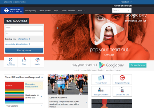
we come for travel information, not to have, on landing 1/3 of the screen filled with an advert (Google Play in this case) .. just because this split screen design is fashionable amongst young designers doesnt mean its ideal for everything (it has it place – if you have little to say perhaps and want a glossy image for your visitors feelgood) .. it actually looks like you’ve bought a cheap wordpress template ..
PS on resizing this text box the ‘submit’ button falls below the fold and is no longer available (Chrome)

I appreciate my comment about ‘young designers’ may offend: an image is worth a thousand words, and a good image does create visitor feelgood. Great perhaps for blogs, or especially those with something to sell, or a fund-raiser, etc. but for an information site? Really?

Its very trendy, but look at the user case: do they want first to have to scroll to get the content *they* want/came for? Such design puts what the site wants (to show off) first, and the reward the user second. If the point of the image is as a call for action, fair enough.
For the record, the advert space is nearly 400px high – most laptop screens are no more than 800px (so that’s half!). In the above case, its actually bigger than the Journey Planner box.

I dont mind the rest of the design, tiles aren’t bad (some dont like them), though ‘live tiles’ work better for delivering information rather than just as links to other pages (ie. big buttons).
I do worry though about ‘wasted’ white space, as in being forced to follow a link in get information that could have been included. You could have a ‘responsive’ flowing design of moving tiles ..The screen grab above is cropped to content width, 1280px wide and not luscious wide screen.

The black/orange/white colour gradient is rather warming though, dont you think? Makes a change from common cold contrast black/white or blue tones.

As an aside, the other common design fail, not in TFL’s case, is immediately on landing, being greeted with a pop-up to sign up or give feedback (difficult when you’ve just arrived). Take note, we know who you are.

Sorry if I sound harsh – reality bites. Maybe I should apologise for slagging WordPress/themes.

Only failure makes you learn what not to do next time (it doesn’t have to be your failure though).

Chindōgu: were we sold that gadget as a solution to our problem? A Xmas thought, whilst you search for gifts

Chindōgu: were we sold that gadget as a solution to our problem? A Xmas thought, whilst you search for gifts

Is coding going over the top and overly complicated? Create code that matters

OK, the computer Science Education Week is coming to an end – hope you’ve had fun.

Of course, the coding doesn’t have to stop! – keep building, testing, refining – make something that makes a difference!

Lets look at something I have seen rather a lot of over this week, and in my mind at least, relates to lack of proper planning and getting caught up with bells-and-whistles
– Elegant solutions come from planning

I know people, read: designers, are looking to an ‘assembled web’, where everything is created by libraries and plugins.

Not picking on anyone, I just happen to see this example, and being my personal bugbear, not everyone enjoys high-speed Internet access everywhere
– so why overload pages with redundant weight (and ‘garbage’)?
– especially when it comes down fancy bells & whistles/ eye-candy?

Just try it over a dial-up modem connection .. and dont be so arrogant.

Side-chat over ..

You certainly wont learn coding doing this ‘assembly’ stuff idea

ZURB reports loading Facebook, Twitter, Google share widgets took 19 HTTP requests & added 246.7KB to a page’s weight

250KB is a few thousand words that actually say (and mean) something, or maybe 5 pictures (that maybe dont). More design sophisticated for sure, but the web is becoming so visual, something that no-one reads any more. For me, that’s sad
– the number of sites that take me ages to work out what the company or product actually does, how it works, just gets me down. It looks pretty and the message is getting lost.

Some say a picture is worth a thousand words – yeah, depending on the picture. And I can read a 1000 word summary on the Mona Lisa faster than most ordinary mortals (and me) could decipher the hidden qualities studying the picture .. I digress.

Back to the point. For example: letting.js, a jQuery library,  spotted on CreativeBlog: Polyfills

<script>
$(document).ready(function() {
$(“.fancy_title”).lettering();
});
</script>

(remember to write the code to embed the jQuery and the letting plugin as well)
– the idea is you then manually adjust the CSS for each .char#, adding salt according to taste ..
– outputing this HTML

<h1 class=“fancy_title”>
<span class=“char1”>S</span>
<span class=“char2”>o</span>
<span class=“char3”>m</span>
<span class=“char4”>e</span>
<span class=“char5”></span>
<span class=“char6”>T</span>
<span class=“char7”>i</span>
<span class=“char8”>t</span>
<span class=“char9”>l</span>
<span class=“char10”>e</span>
</h1>

So, since you are such an ace coder, why not just code the <span> classes in the first place?
– a simple JS loop would ‘document.write’ this without clutter
– or, Heaven forbid, just write the HTML (h1-)heading – how often is it going to change anyway?