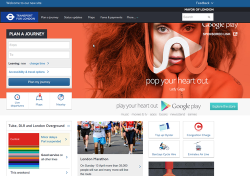
we come for travel information, not to have, on landing 1/3 of the screen filled with an advert (Google Play in this case) .. just because this split screen design is fashionable amongst young designers doesnt mean its ideal for everything (it has it place – if you have little to say perhaps and want a glossy image for your visitors feelgood) .. it actually looks like you’ve bought a cheap wordpress template ..
PS on resizing this text box the ‘submit’ button falls below the fold and is no longer available (Chrome)
I appreciate my comment about ‘young designers’ may offend: an image is worth a thousand words, and a good image does create visitor feelgood. Great perhaps for blogs, or especially those with something to sell, or a fund-raiser, etc. but for an information site? Really?
Its very trendy, but look at the user case: do they want first to have to scroll to get the content *they* want/came for? Such design puts what the site wants (to show off) first, and the reward the user second. If the point of the image is as a call for action, fair enough.
For the record, the advert space is nearly 400px high – most laptop screens are no more than 800px (so that’s half!). In the above case, its actually bigger than the Journey Planner box.
I dont mind the rest of the design, tiles aren’t bad (some dont like them), though ‘live tiles’ work better for delivering information rather than just as links to other pages (ie. big buttons).
I do worry though about ‘wasted’ white space, as in being forced to follow a link in get information that could have been included. You could have a ‘responsive’ flowing design of moving tiles ..The screen grab above is cropped to content width, 1280px wide and not luscious wide screen.
The black/orange/white colour gradient is rather warming though, dont you think? Makes a change from common cold contrast black/white or blue tones.
As an aside, the other common design fail, not in TFL’s case, is immediately on landing, being greeted with a pop-up to sign up or give feedback (difficult when you’ve just arrived). Take note, we know who you are.
Sorry if I sound harsh – reality bites. Maybe I should apologise for slagging WordPress/themes.
Only failure makes you learn what not to do next time (it doesn’t have to be your failure though).
