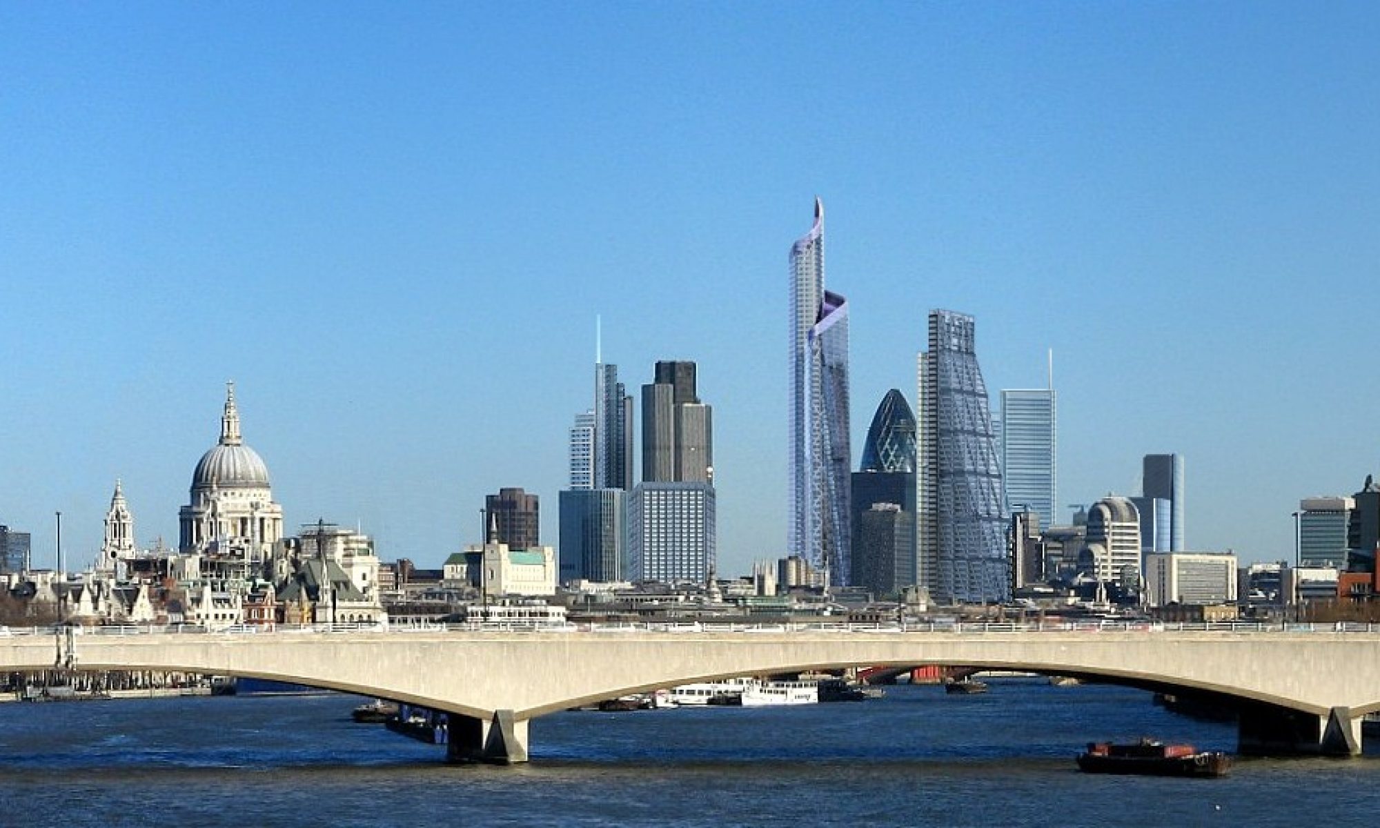
found on a recent design-led article
There are 2 types of designs.
1- User enters the page, thinks how cool the page looks, plays with jquery functions, slides up, down etc. BUT (a very big but) doesn’t or can’t focus on the content. Which we all want eventually is the content.
2- User enters the page, thinks a normal page, therefore focuses on the content.
All my life I tried to balance those 2 in my designs and its quite hard.
In which I never understood people who liked pinterest style. I’m afraid to tell my opinions about modern designs because supporters & fanboys of those design patterns are worse than hitler. They tend to linch you everywhere with capslock.
Finally my subconscious is free. Thanks for this post. You made me feel relieved.
[anonymous for their own protection]
What’s interesting here is not whether one should predominate over the other, but which is MOST SUITABLE for the site and its message. For example photos look great on a wall (ala Pinterest or Flickr) yet mixed media is presented in a linear fashion on Tumblr.
The question always exists in design, are you designing to the fashion, or applying new ideas creatively?
Your choice: choose.
